Start off by loading the states.shp file (usually found at C:\_GE Data\Sample Projects\United States\Shapefiles\states.shp). MapWindow will assign a default color.
 In order to normalize the data, we are going to use some of the tools that are already available in MapWindow. The first thing to do is open the table for states. This is done be selecting states in the table of contents, and then clicking the Table button (see above). This will open up the attribute table for the shapefile (below).
We are going to add a field to hold the normalized values. To do this, click Edit on the menu, and then select Add Field.
 This will open up the Create Field dialog box (below). For this demonstration, we will create a field named "NormalizedMALES" that is of type "Double" (this will hold a numerical value for us).
Once you hit OK, a new field will be added to the end of the table. Navigate to this field and right-click it. From the menu that appears, select Calculate Values (All Records).
 This selection will open up the Calculate Column Values dialog box. This is where we will enter the algorithm that creates the values in our normalized field.
The algorithm entered below creates a ratio that is based off of the total population of males in from each state. The basic formula is (Males from State X) divided by (Total number of Males from all States). We then multiply the result by a factor that does nothing more than elevate the value so that the states will extrude far enough off of the surface to not intersect the Google Earth.
The formula used for this example is (MALES / (Sum(MALES))) * 1000000.
(NOTE: use of the multiplication factor is not really necessary if you do not plan to use this field as a height value. It also does not need to be nearly as big as the number we used here when using polygon features that are smaller than states, such as buildings.)

After you have entered the formula (above), click the Apply button. This will populate the new field you created with the normalized values.

After hitting Apply, click Close to close the dialog box. Also make sure to click the Apply button at the bottom of the table before closing. This will save your newly created data.
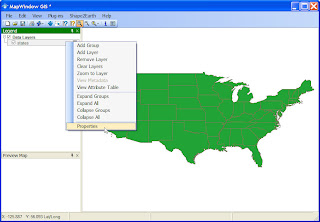
Now that we have a new field with normalized data, we will change the colors of each State based on this new value. Review the demonstration Changing Polygon Colors to see more information on changing colors. The two graphic below are a quick walk through of accessing the Properties and changing the colors.
One more step we will want to take is to spread out the color ramp. To do this, enter a number that is larger than the total number of records (in this case, 48 States).
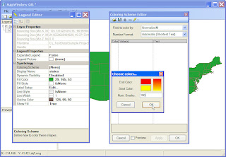 Red and Yellow have been selected as the ending and starting color, and 100 has been entered for the number of breaks. The spread values can be seen below.

Now we can see the normalize values in MapWindow. Notice how the color values have been much more spread out compared to the map created when we used the raw data in MALES field.

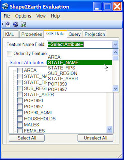
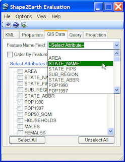
 It is also a good idea to always select a Feature Name Field to name each of your Placemarks in Google Earth (see below).
Finally, convert the data and load it into Google Earth. Compare this map to the one created with non-normalized data (viewable HERE).

One more step we will want to take is to spread out the color ramp. To do this, enter a number that is larger than the total number of records (in this case, 48 States).
 Red and Yellow have been selected as the ending and starting color, and 100 has been entered for the number of breaks. The spread values can be seen below.
Now we can see the normalize values in MapWindow. Notice how the color values have been much more spread out compared to the map created when we used the raw data in MALES field.

Now that we have our normalized data ready in MapWindow, we can convert it to KML for viewing in Google Earth.
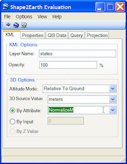
Click Shape2Earth in the menu and select Export to KML. After Shape2Earth opens, change the Altitude Mode to Relative To Ground, click the By Attribute option, and then select the NormalizeMALE field from the drop down box (keep the 3D source value at Meters).
 It is also a good idea to always select a Feature Name Field to name each of your Placemarks in Google Earth (see below).
Finally, convert the data and load it into Google Earth. Compare this map to the one created with non-normalized data (viewable HERE).
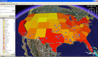
This Google Earth map below is much easier to understand and easier to view.
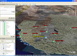
 Normalized data is also very useful when not creating height values. The map below was created using the normalized data with the height set to Clamped to Earth, and the centerpoint label option selected.
 Normalized data is also very useful when not creating height values. The map below was created using the normalized data with the height set to Clamped to Earth, and the centerpoint label option selected.


